
ΧΨΜΩΠ ΘWΛфΠ
The website of
● Actor
● Artist
● Data Ninja
● Director
● Document Designer
● Software Engineer
● Wordsmith
Creative Xym being creative
I did a logo for Jacquard Anthems! And because peopled asked, I've detailed the step by step process taken as to how I came up with it.

The making of a logo
Step #1 - basic concept

The logo was inspired by John "King Of The Goths" Faircloth, who is a huge Sisters fan, so I thought it would be fun to create him in a Sisters Style.
So, as I starting point, I looked at the classic logo on the Greatest Hits cover:
Simple enough - three rings, some text, and a face looking up and to the left.
Step #2 - base image

Well, I found John's DJ profile image - I could reverse that image, and with a bit of rotating, I can get John in the correct position to create the black & white outline.
However, John isn't the only DJ. What about John Fry?
So, somehow I need to incorporate the two. As I like the circled text, is there another logo I could find to replace the solitary head?
Step #3 - alternative central image

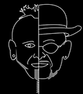
Well, the nearest Sisters image is this. A face, one head, tilted looking upwards...
I can work from this - how about I put a dividing line down the centre, and have it half-and-half?
Right - concept in place. Let's start creating a logo
Step #4 - The easy bit!

I did this bit in PowerPoint, as PhotoShop CS2 doesn't appear to have the ability to create curved text.
Simple this bit really - a series of cocentric circles in white & black, overlaid with 2 text elements using Format > Text Effects > Transform to create the curved text.
The font used was Caslon Antique which is similar (if not the actual) Sisters font..
Step #5 - John & Jon source image

Now I just need a photo of the DJs to base the head on.
Luckily, this photo was taken at the last event, so I have the two together, which is ideal...
...and as John is on the left, and Jon on the right, that's why their names are in that order on the logo.
Step #6 - Combine faces to create the logo base

Now I have to create the basis for the faces, and merge the two into one!
A bit of cut, paste, rotation, and I manage to create this ungodly hybid!
Right, on with the tracing...
Step #7 - Outline key features

Well, for this I had to train meself in how to draw curved lines in Photoshop, as using a mouse was useless, and my tablet pen decided not to work!
So , a few plotted points and path stroking on a new layer later, and I get this image.
(I had to move John in a bit, to compensate for being at an angle to the camera, and not head-on)
Looking good so far!
Step #8 - Separate out two-face for assessment
Drop in a solid black layer between the photo and the drawn lines.
Voila - perfect!
Almost - I forgot to draw in John's dangler. Oh well.
Step #9 - Final composition

Import the PowerPoint image, delete the central black core, and overlay it onto inage of two-face.
Finally, remove the outer black to create a transparent background for web display.
Done. And everyone is most impressed. Especially John, being rendered in his favourite bands image.